Hello, and welcome to my grand gif museum. I have made quite a few gifs in the course of my Pilot Wave Hydrodynamic Research, and need a place to display them with an explanatory caption. I make them at giphy.com, but that is both unprofessional-looking and does not let me leave notes on what the gif is. So I will use this page as a museum of sorts. As I make more gifs, I'll add them here so you can see them, and I can remember what they are gifs of. The newer gifs appear at the top, and the farther down the further back you'll go.
So, we're getting farther and farther down the rabbit hole. To recap my distillation of φ and my distillation of η, I have found almost all of these terms seem to be Bessel functions, except for the gravity and η component of the equation for φ. As such, I broke that down here! There is also the φ component of η, which ends up with a chicken-egg scenario, but for now I focused on this one. The blue graph below is "the Laplacian of η in φ." That is, the component describing the time evolution of φ, the velocity potential, that is itself the Laplacian of η.

Yes, ok, this one, this one seems like a Bessel. We also see at the point of impact a deformation in this wave, which does indeed line up with the other part of the PDE of φ.
This next graph is the part that not only lets the velocity potential affect the surface, but also includes the topology of the container. It makes sense that this is the term that is harder to predict than the others. Still, let's take a gander.

Eh, ok, this is still hard to interpret. Let's take a look at this function, but add in the total sum of φ in black.
Not to get too excited, but that is not half bad. I feel like the non-oscillating parts of the whole thing line up well with the midline of this green graph. I'll be doing some longer tests, as well as asking other, smarter people if they can interpret it at all.
Alright, here we have some quite pretty graphs. If you haven't read Distilling η bellow, then I'll fill ya in quick. Each of the PDEs in this model consist of a sum of a few terms, 2 in the case of η and 3 in the case of φ. Bellow, we 'distilled' η by looking at the parts of its sum over time, and here we shall do that with φ. Below you will find an animation for all of these parts, and the sum of them with the black line.

This gif is an absolutely wild unit of a time, wouldn't you agree? I can't tell what is going on at all, so let's split it up! First, we look at the green line compared with the black line sum. In the PDE, green is a term involving the shaking of the table and the wavefeild η. Since this model reframes the shaking table as simply changing gravity, I'll call this the gravity-η component of φ. It's somewhwat easy to remember, green for gravity!
Let's break down what we see here. The green wave is essentially a Bessel function, with its midline hovering around the black line. That is to say, it is a Bessel function that is shifted upward to correspond to the height of black line φ. Ignoring the initial spread of the Bessel, it is consistent in shape, and it looks like amplitude is consistent as well (although citation needed here), and changes mostly in that midline offset. The midline offset does appear to ignore the oscillations in the black line and center instead on the long form waves in the black line, though more thorough testing would be needed to conclude that for sure.
Next is the blue line, which is based on the double spatial derivative of η. Since η is the fluid bath, I made it blue. It seems to be almost a Bessel function too, although it has an odd bit in its center trough, almost like a chunk was cut out. It seems to keep its midline at the zero point, but varies its amplitude over time.

And now onto the red line, which is the double derivative of φ. No, it doesn't have as fun a reason for its color.
Now, if you're me, this might seem oddly like the missing bit of the blue bessel function! It seems to pretty much only peak at the center, while the blue wave is missing this! Since this distilling process is 100% following hunches, I decided to graph the sum of these two waves, aptly colored "purple". Ok, it came out magenta. Sue me!
Oh hoh hoh, yeah. We're getting somewhere! Unless this results in disappointment in the end. But a man can dream. This wave seems to be be responsible for the small oscillations in the black line, as they correlate with the increasing and decreasing amplitude of the purple/magenta line. Where peaks are, the black line peaks when amplitude is max and troughs when it is min, and vice versa for the troughs. To really see how these two interact, let's graph the purple/magenta line and the green line together.
Absolute poetry! The troughs and peaks of the two colors line up perfectly, cancelling out mostly except for when magenta modulates in amplitude, and following the center of green. This seems to imply that if we set green's midline to zero, we would have no long form, non-oscillating waves, and thus it acounts for that. Likewise, that amplitude modulation in the purple wave accounts mostly for the small oscillating waves! If these can be sorted out and described with time-dependent equations, we may be golden, at least when solving for φ.
And of course, I should end it there. But I won't, I've got stuff to try. Let's set lambda lower. Lower lambda means that the wave will decay faster, as the table shakes less forcefully. It is essentially how much power we put into keeping the Faraday waves waving in the model.
Here, we see the oscillations (both in the total wave and in the heights of the pink wave) decay much faster than when lambda is higher, and soon the main thing changing is the midline of green. This view makes it seem like the black and the midline of green don't quite line up, although the waving artifacts from using FFT makes this less than obvious.
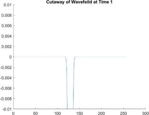
This set of gifs are a bit odd, so stay with me. The PDE's for the fluid bath are a bit wild, but I love 'em. We get to watch two different functions evolve with time, the velocity potential φ (long story, that one) and the height of the fluid bath from zero η. See (to do link to faria model page when made) for these equations. But the gist is that the time derivative of η has both a φ and η term. I happened to have a gut feeling that, maybe, these terms could seem simple-er when graphed on their own. If I can find a simple expression for both of these terms, I might be onto something.
First, we look at the φ term over time (in blue) compared to the complete η.
Ok, not too bad. This gif seems to imply that the velocity potential term seems to be related to the longer term, non-oscillating waves. While it is most definitely wavelike, and its amplitude seems to pulse, the "average" of the heights seems to be about the slowly moving waves. I wonder if this could be further distilled...
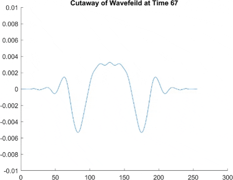
Alright, this red one is the η dependent part of η. Yeah, that's a bit confusing. But the change in η over time is related in part to the double derivative of η in the spacial x and y dimensions. And here it is.

Gosh, this is so interesting! We can see it is still quite crazy in the begining. But, as time goes on, it settles into an almost constant Bessel function. There is some oscillating in it at first, both in height and along the slow-moving wavefront, but it seems to trend to a steady state with an average height of zero.
This is very promising! I think I ought to distill φ next, to see if that generates more pure graphs. My hope being that the variation in these gifs come from the fact φ distills well, and it just takes time before that fully shows itself in η. Well, I'll be sure to update this page when I do distill η!
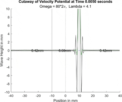
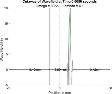
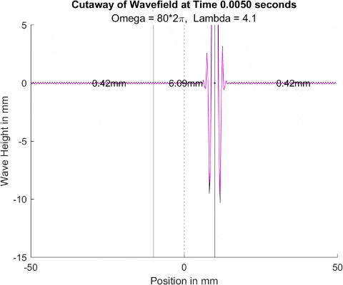
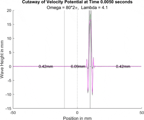
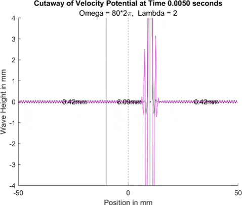
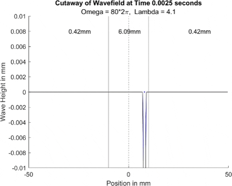
Below in The New Faria Fluid Bath, I showed the new vibrating oil bath simulation and how pleased I am with its results. Here, I'll explore how the waves on the surface interact with barriers. All these test start with a very tight, normal disturbance centered on the little blue dot in the graphs. The dashed line is the center of the graph, where x = 0, and the solid lines are where the boundaries of the well are. Inside the bold lines, we are simulating a deep bath of oil (~6mm) that easily allows waves on its surface. Outside them, we have shallow regions that act as a barrier that, in physical experiments, tends to dampen waves.
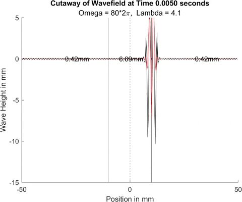
I explored many different depths for the shallow region, ranging from 0.42mm to 0.000001mm, as zero causes a divide by zero error. While these later tests are not physically possible (the waves are taller and would thus bottom out), I wanted to push the limits to see what would happen, and if I can find a pattern for how the barrier depth effects the wave. I also did tests where the initial drop was at 10mm, 9mm, and 8mm. The 10mm test was right at the boundary, so we should get to see a side by side of dampened and undampened waves. Both 9mm and 8mm are to see how distance from the barrier effects the phenomena observed. First, we look at the 0.42mm deep barrier.


These results already are quite cool! While graphically, the difference is small, those small differences may have huge implications once I program the droplet. The underlying wave seems to not mind the barrier much, the island in the middle and the two troughs that move away from the origin. But the small, oscillating waves seem to be dampened significantly once over the border. To show this effect more drastically, let's see the animations where the shallow depth is only 0.01mm.


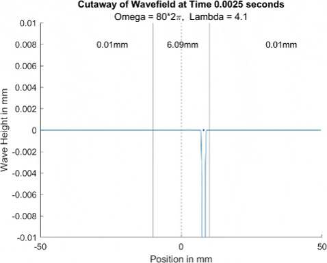
These are so cool! We see a much more dramatic dampening of the small oscillating waves, which I think is a super cool thing to note. Maybe it'll have large effects in the bouncing, but I'll be on the lookout for it. I believe the paper says it's a reflection of waves at the barrier that helps making a droplet reflect, but I couldn't quite see any reflection.
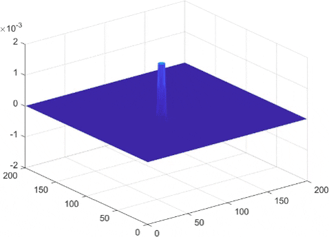
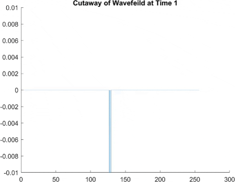
These gifs show off an oil bath model from a paper by Luiz Faria. I reprogrammed this model in order to more accurately simulate the oil droplet that will eventually bounce on top of it. At first, I used a finite element method, meaning that to get derivatives at a point, it looks at its neighboring points. This is less accurate than a method I'll use later, but it is still cool to see here. If you have taken calculus, it is the same method as just taking the slope between two close points to estimate the derivative.

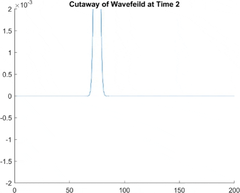

While the finite element method had good results, we can make a more accurate and quicker running simulation using something called fast Fourier transforms, which if you're curious, involves approximating the surface waves as a sum of sine waves, and then taking the derivative of each sine wave individually to find the derivative of the surface wave. This means instead of seeming pixelated, we instead tend to see a small wave pattern in what would be a straight line. But generally, the amplitude of this is small enough that it is not too big a problem.
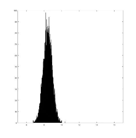
This graph takes quite a lot of explanation, and it is honestly a bit out of date. Using the older model of Pilot Wave Hydrodynamics I worked on in early 2021, I ran 10,000 experiments of a droplet walking towards a barrier, set up so it had an approximately 50% chance of reflecting and 50% of tunneling. I took the positions of these 10,000 drops and made an animated histogram so that each black bar represents how many of the 10,000 droplets were at that place at that time. What we end up with is a probability distribution over time. The higher the bar at a point, the more likely you are to find a random droplet there. Now, if you are familiar with quantum stuffs, you'll recognize this is similar to the square of the wavefunction of position! In fact, this graph looks quite similar to quantum tunneling graphs! I hope to recreate it with the Faria model soon.